Unifying fragmented booking into a 45% faster travel experience

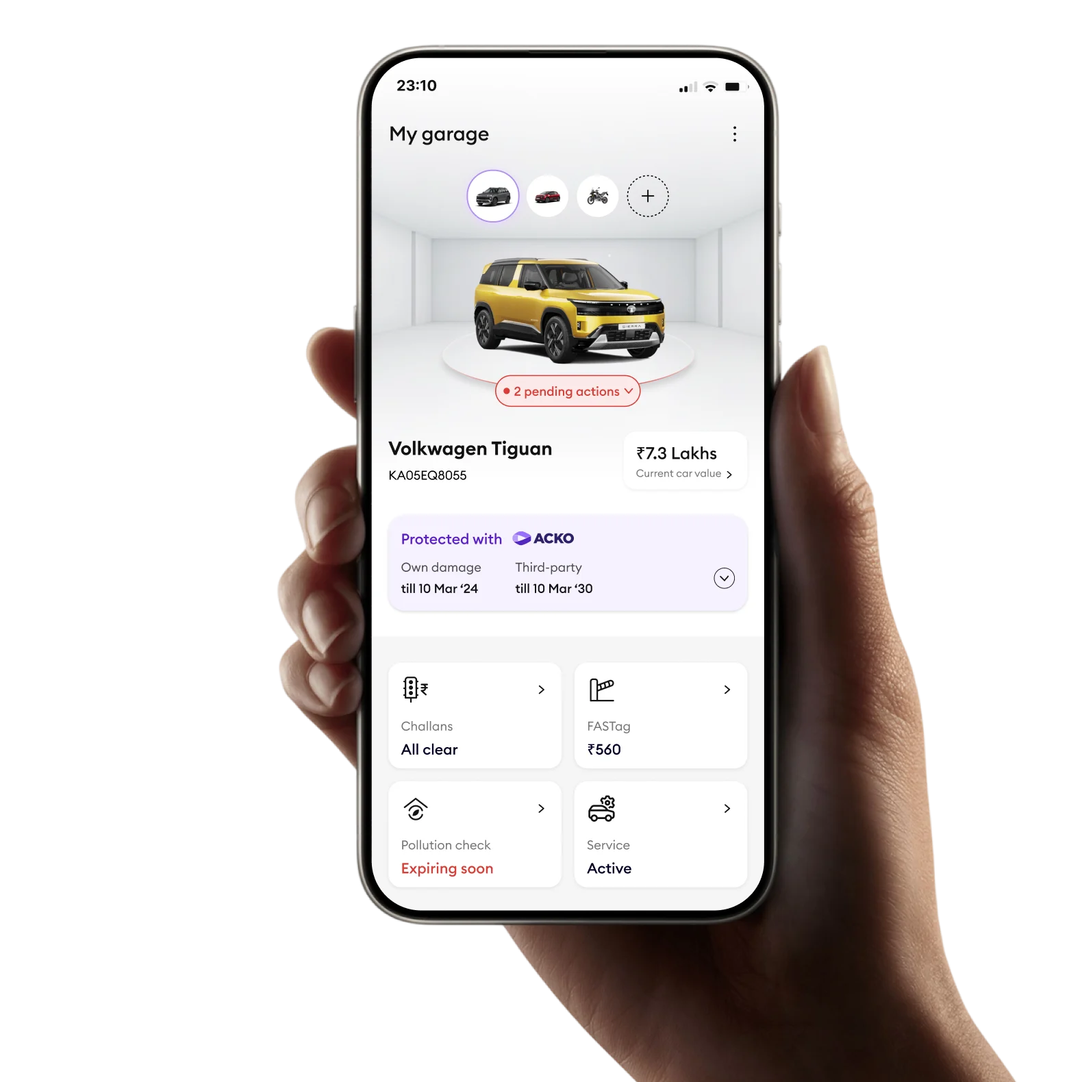
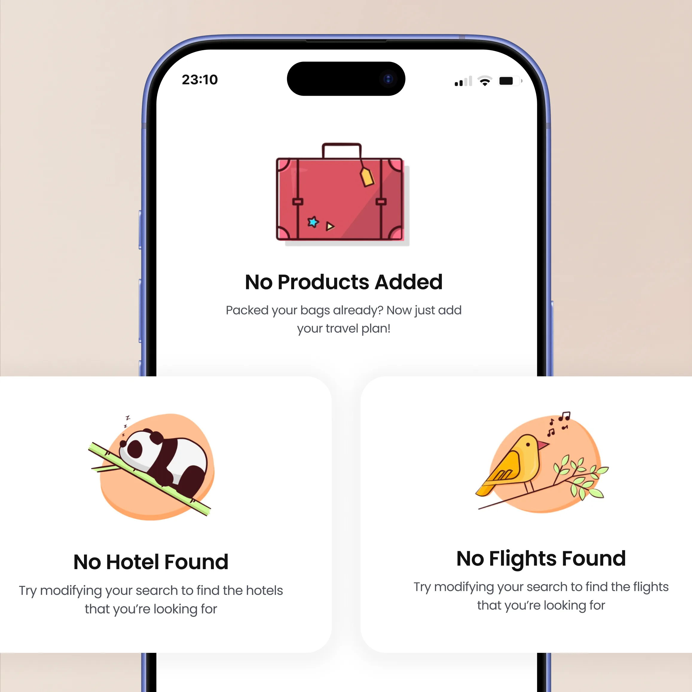
Unified booking, approvals, and expense flows into a single streamlined experience.

Happay Travel case study
Summary

Led the end-to-end UX redesign of Happay Travel, transforming fragmented booking workflows into a cohesive experience that achieved 89% policy compliance and 3.2× user adoption.

45%
Faster Booking
Reduced end-to-end booking time
89%
Policy Compliance
Vs. 52% pre-redesign baseline
3.2×
Adoption Rate
Post-launch user growth
The problem space

Happay's Travel and Expense benchmark report revealed that 78% of enterprises were still using manual or semi-automated travel management. But "fixing corporate travel" is vague, we needed to find the right level of the problem to solve.

The Fragmented Landscape
Email-Based approvals
Email-based approvals
Trip requests and approvals happening through endless email chains
Multiple platforms
Multiple platforms
Flights, hotels, and expenses managed across 4+ different systems
No visibility
No visibility
Finance teams struggling to track spending and ensure policy compliance
THE PROBLEM
~9 days to book a business trip
Manual workflows, coordination overhead, and fragmented tools created massive delays.
THE OPPORTUNITY
Unified trip-based platform
Single destination for end-to-end travel with built-in policy compliance.
There is no single platform with complete trip management, approvals and bookings happen through emails.
- Happay T&E Benchmark Report, 2018
Defining the right problem

Before jumping into solutions, I facilitated an Abstraction Laddering workshop with stakeholders to ensure we were solving the right problem at the right level.

Abstraction Laddering
↑ WHY? (Abstract) ↓ HOW? (Concrete)
Too abstract
How might we help employees be more productive?
Opens too many solution spaces, not actionable.
Abstract
How might we reduce time spent on administrative tasks?
Still broad, but directionally useful.
Sweet spot
How might we unify the corporate travel booking experience?
Actionable scope with clear, measurable success criteria.
Concrete
How might we reduce clicks in the flight booking flow?
Useful for optimisation, but misses systemic issues.
Too concrete
How might we add a "corporate only" filter to search?
A feature, not a problem - limits creative thinking.
Why this level?

"Unify the corporate travel booking experience" was the right scope because:

  • Specific enough to measure (booking time, compliance rate, adoption)
  • Broad enough to allow multiple solution approaches
  • Addresses root cause (fragmentation) not just symptoms (slow booking)
  • Aligns with business goal, platform stickiness through Travel and Expense integration
Key Outcome
The laddering workshop aligned stakeholders who had different mental models. Finance saw "expense compliance," Product managers saw "faster bookings," and travel admins saw "fewer support tickets." The unified frame helped everyone rally around a shared goal.
From problem to opportunity

With the right level defined, I reframed the problem as an actionable design challenge.

Initial Brief
"Redesign the travel booking platform experience"
Vague, no success criteria defined
Reframed Challenge
"Create a unified trip-based booking experience that achieves 90% policy compliance and reduces booking time by 50%"
Measurable, time-bound, user-centered
Hypothesis

Based on the problem framing, I developed testable hypothesis to guide design decisions:

Trip-based cart reduces booking time
If we use a trip-based cart model that groups flights, hotels, and transport together, users will complete bookings significantly faster than the fragmented multi-platform workflow.
→ Measure: End-to-end completion time < 5 min
Inline policy visibility reduces violations
If we surface policy compliance indicators inline during search — rather than blocking or hiding non-compliant options — users will make compliant choices with less anxiety and fewer escalations.
→ Measure: Policy compliance rate > 90%
Top navigation improves feature discoverability
If we replace the side navigation with a horizontal top nav pattern, users will find key features faster and the content area will feel less cluttered in a data-heavy booking interface.
→ Measure: Task completion in < 3 clicks
Smart recommendations increase cross-bookings
If we auto-populate hotel and transport searches based on the flight already in the trip, users will add more products per trip instead of dropping off after the first booking.
→ Measure: Multi-product trips > 40%
Research insights

Through 12 stakeholder interviews and 8 contextual inquiry sessions, I validated the problem framing and uncovered three key insights:

01
Users think in "trips," not products
Mental model centred on the complete journey, not individual bookings. Directly validates a trip-based architecture over a product-first IA.
02
Policy anxiety causes abandonment
Fear of non-compliance led to excessive manager check-ins before booking. Validates the need for inline policy indicators to build confidence early.
03
Mobile is critical for frequent travelers
67% of frequent travelers needed to modify bookings while on the road. Validates a mobile-first approach and real-time itinerary access.
Key design decisions

Based on research and problem framing, I made four strategic design decisions:

01 Trip-Based architecture
Problem
Users booking flights, hotels, and transport as separate, unlinked transactions
Solution
Unified "trip" container that holds all products like a shopping cart
Rationale
Aligns with mental model from research; enables trip-level policy checks in one view
02 Transparent policy indicators
Problem
Original design hid non-compliant options, returning zero results for some users
Solution
Show all options with compliance badges; violations explained and contextualised, not hidden
Rationale
Transparency builds trust; users understand why options require approval rather than hitting dead ends
03 Top navigation
Problem
Side nav cramped content area in a data-heavy booking interface
Solution
Horizontal top navigation to maximise the content area for search results and itinerary
Rationale
Validated with 5-user test; aligns with patterns in TripActions and Concur that users already know
04 Smart recommendations
Problem
After booking a flight, users had to manually restart a hotel search from scratch
Solution
Auto-populate hotel search based on flight destination and dates already in the trip
Rationale
Reduces friction between bookings; increases hotel attachment rate and overall trip completeness
Final designs

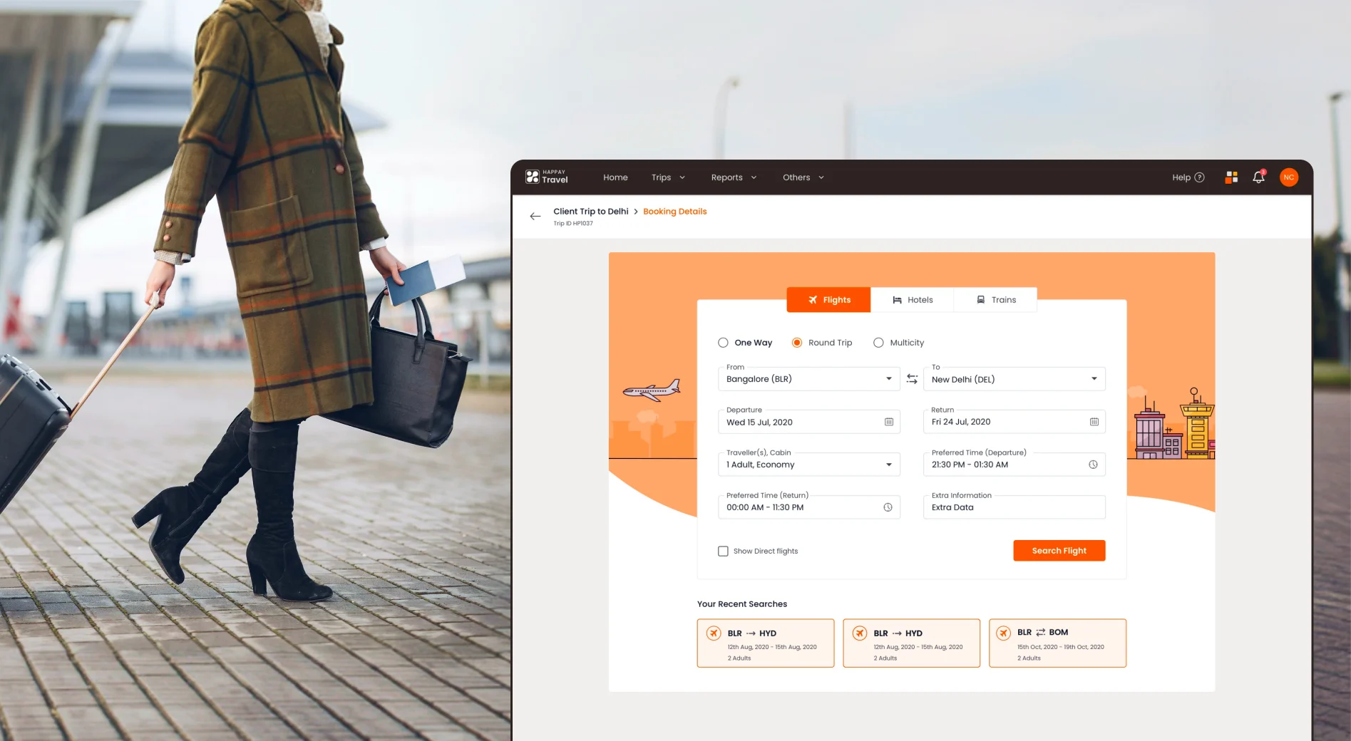
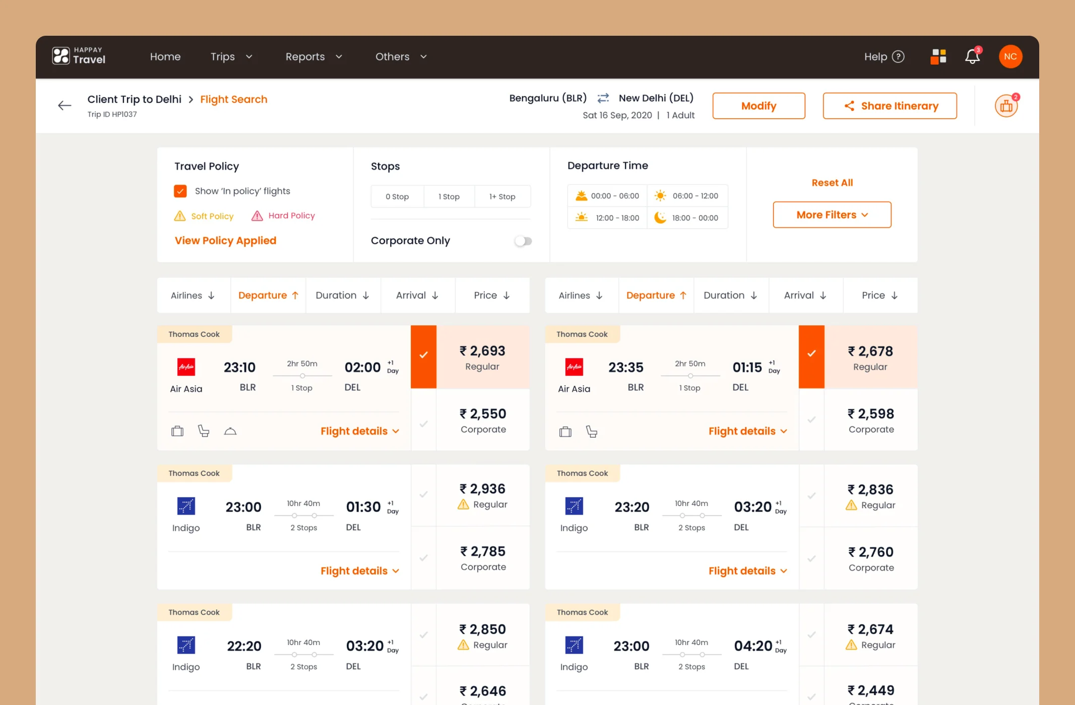
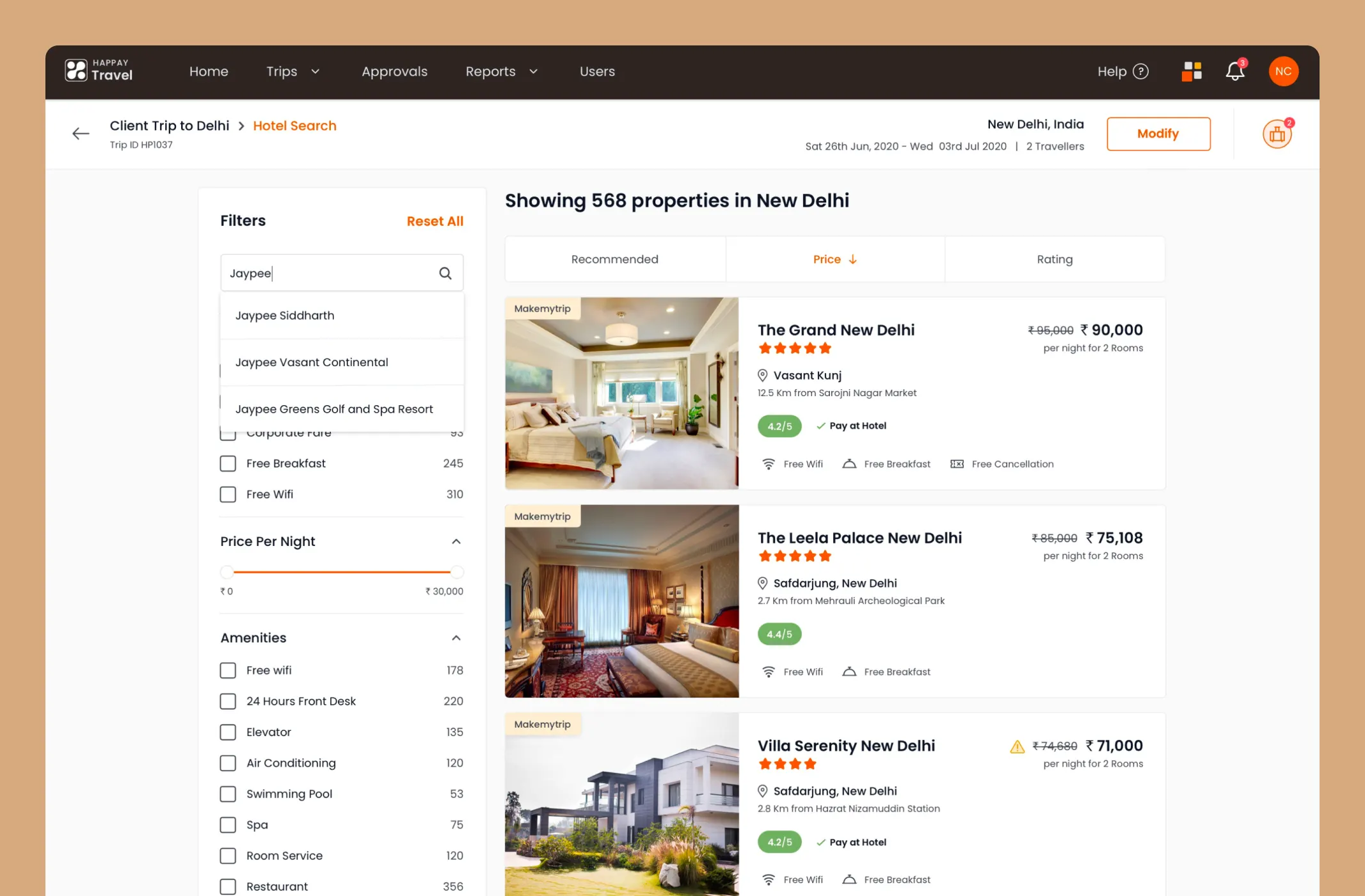
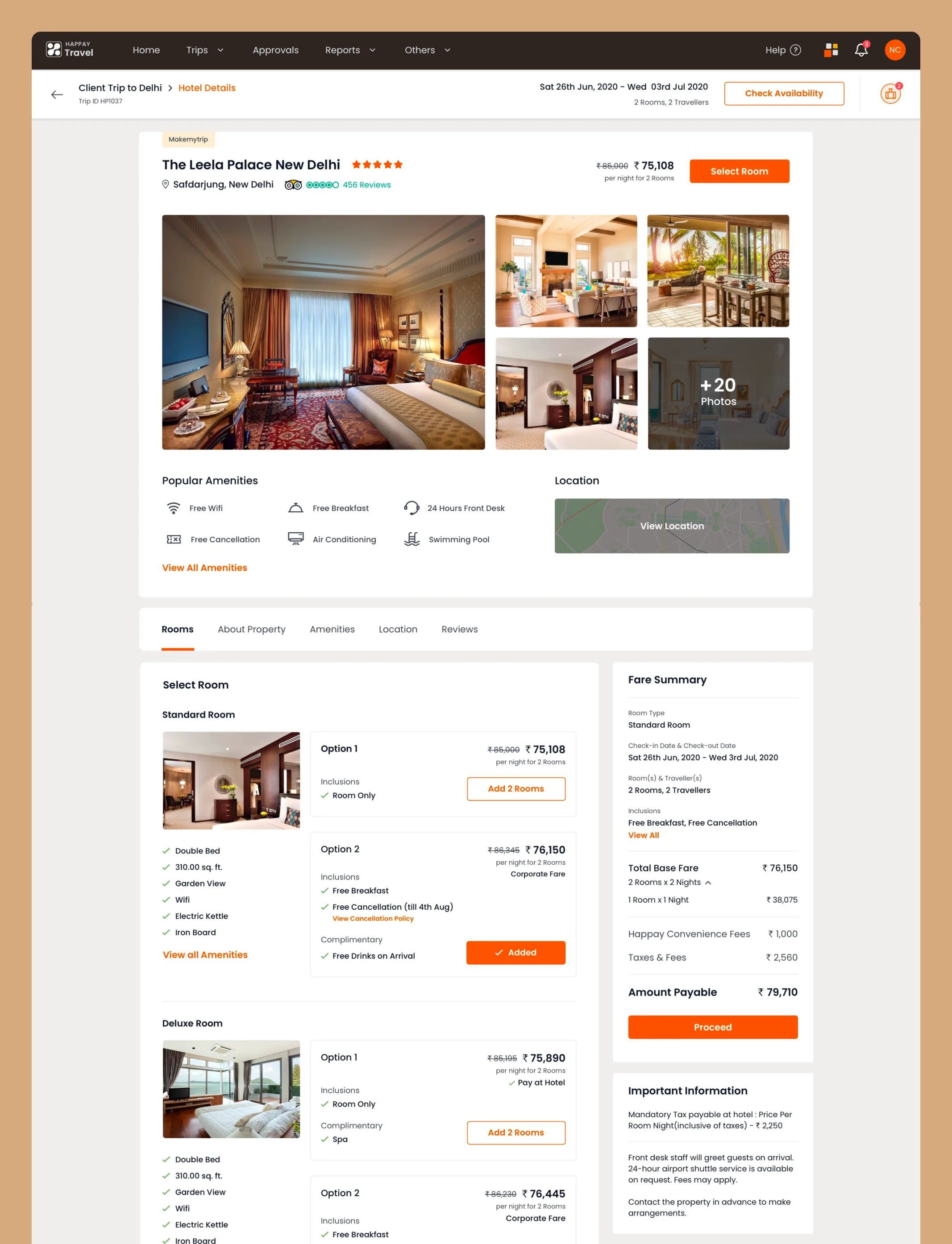
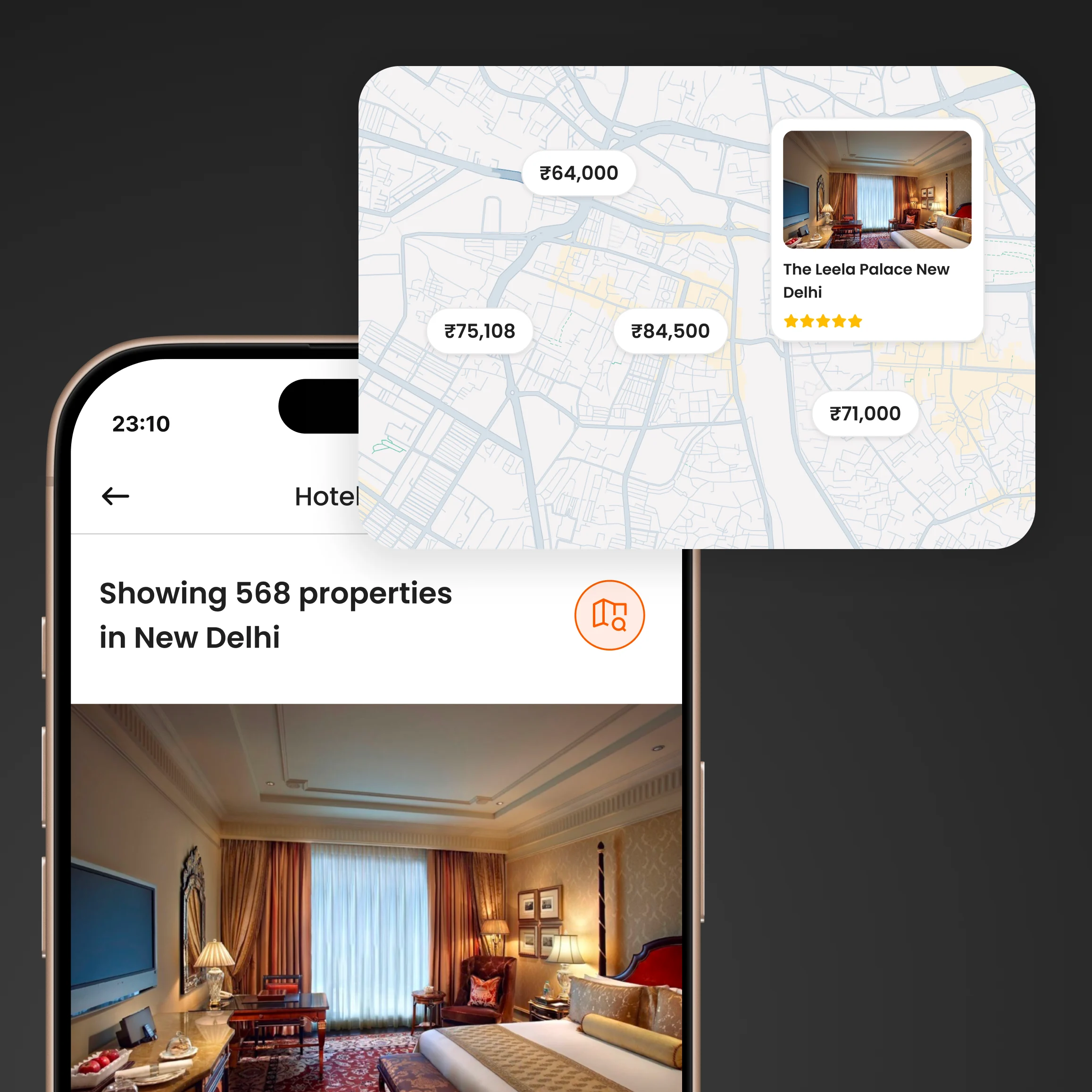
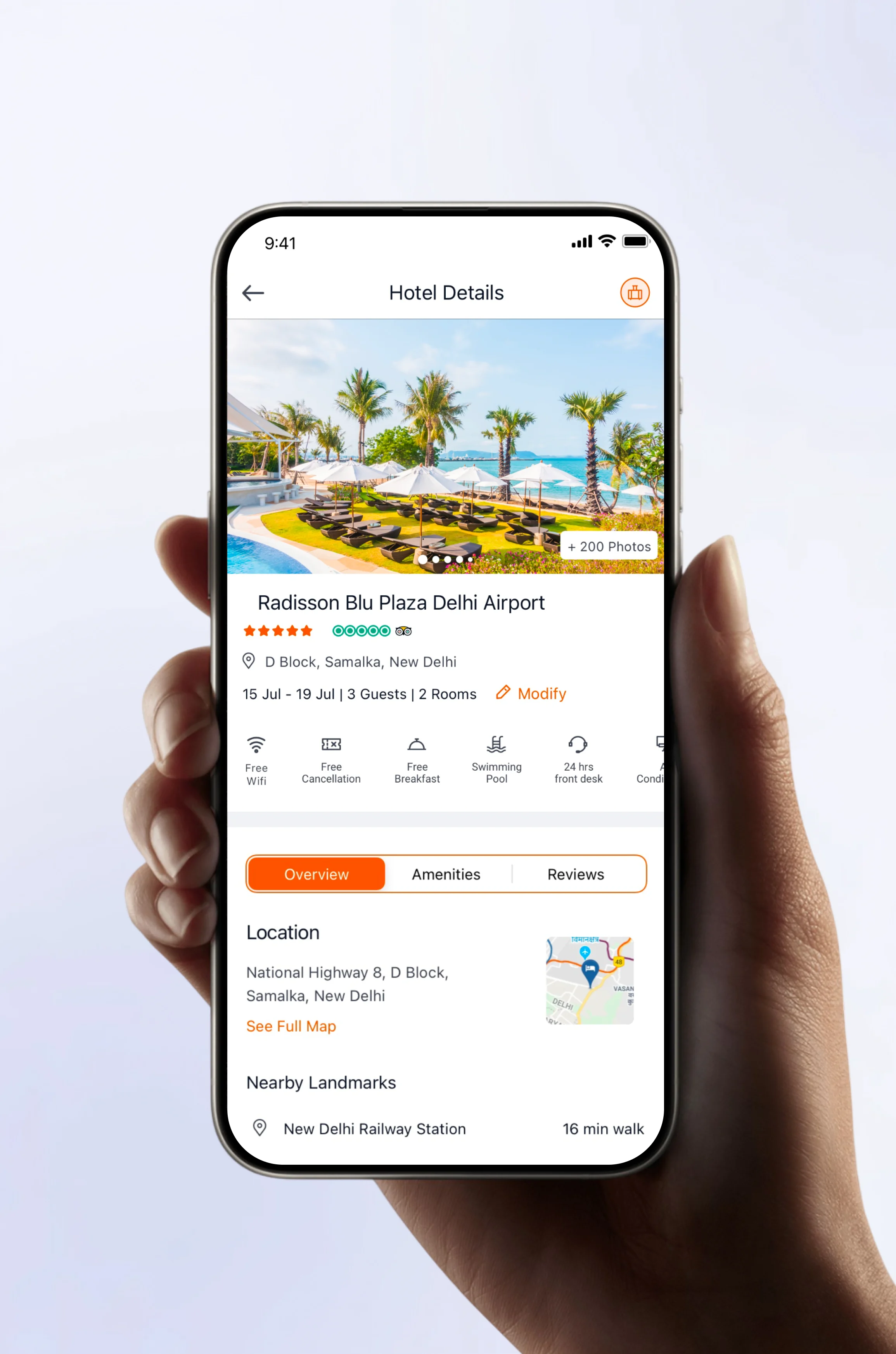
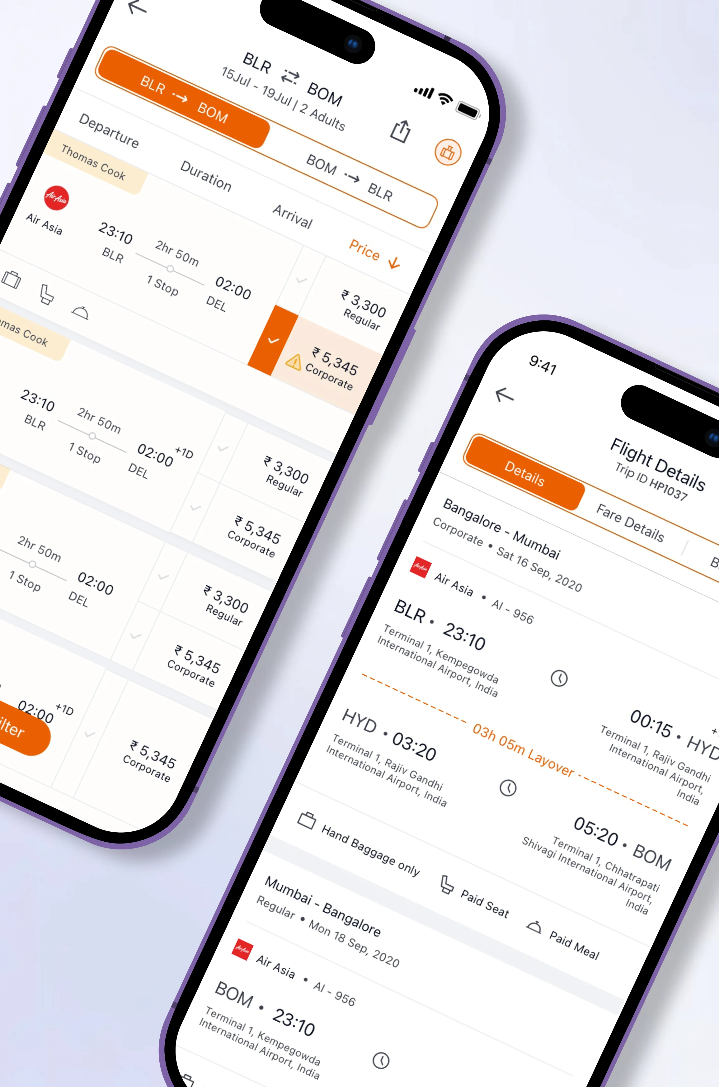
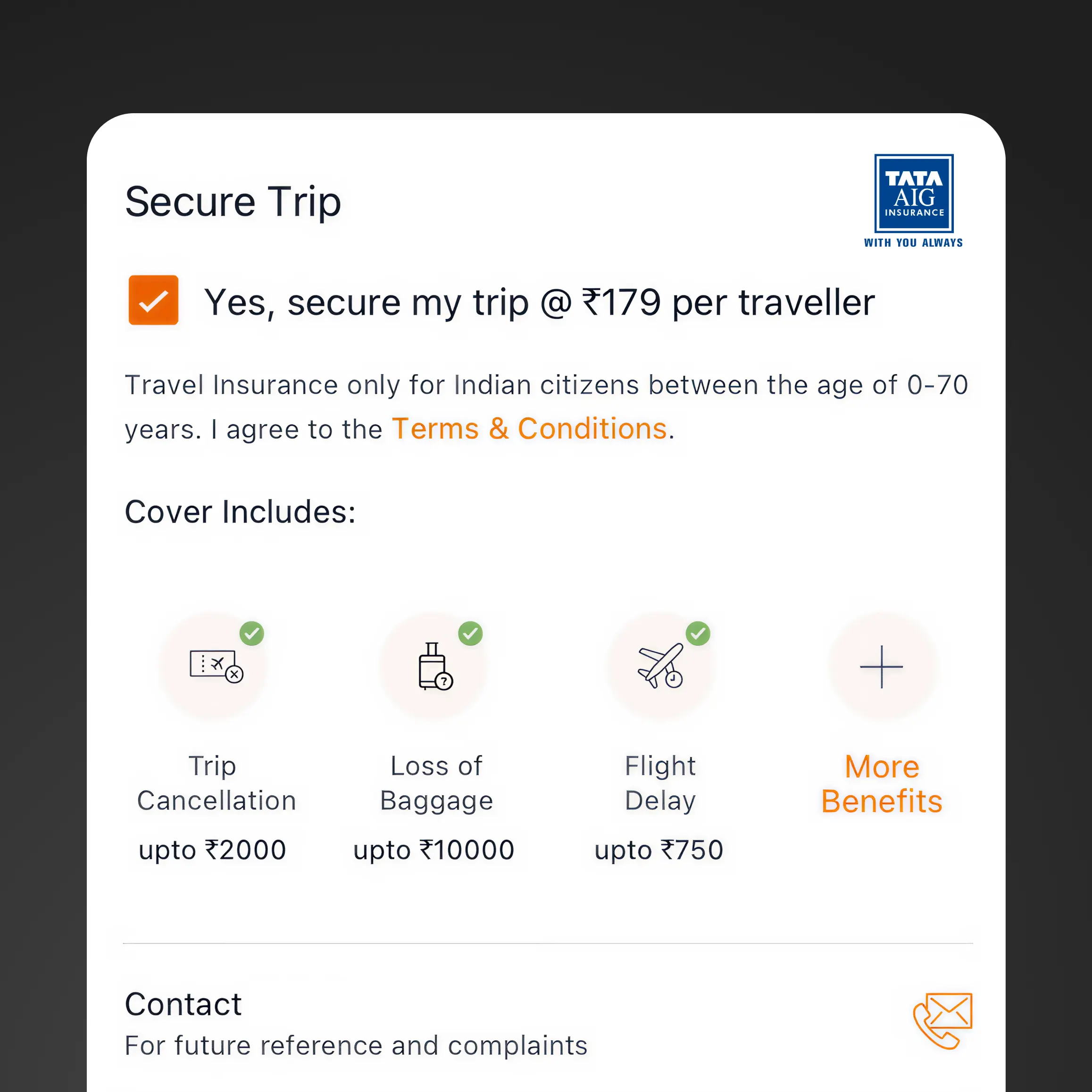
With insights from the framework sessions, style guide, and design system, I moved on to designing and prototyping the full travel booking experience across web and mobile.

Happay Flights
Policy rules are surfaced directly within search, helping employees book faster while staying compliant.
Happay Hotel
Advanced filters and rich hotel details help travelers choose stays that match policy and preferences.
Happay Hotel Booking
Comprehensive property pages give travelers confidence with transparent details before booking.
Results & impact

Post-launch tracking validated 5 of 6 hypotheses within 90 days:

Trip completion time
< 5 min
4.2 min
✓ Validated
Policy compliance
> 90%
89%
✓ Validated
Navigation task clicks
< 3
2.4
✓ Validated
Multi-product trips
> 40%
38%
◐ Partial
Corporate toggle usage
> 70%
76%
✓ Validated
45%
Faster Booking
Reduced booking time
89%
Compliance
Policy adherence rate
3.2x
Adoption
User growth post-launch
Key Learning
"Solving the right problem matters more than solving the problem right. Abstraction laddering gave us shared language where stakeholders had been talking past each other."
Other key projects