End-to-end redesign of ACKO’s app with new IA, growth model, and a primary acquisition and retention engine.
I led the end-to-end redesign of ACKO's mobile app, turning it from a transactional policy viewer into India's first protection platform. I redefined the information architecture, designed the growth and engagement model, and translated the company's "Protect, Prosper, Preserve" vision into a product that grew from ~500K to 15M+ app installs and 44M+ free service interactions since launch.
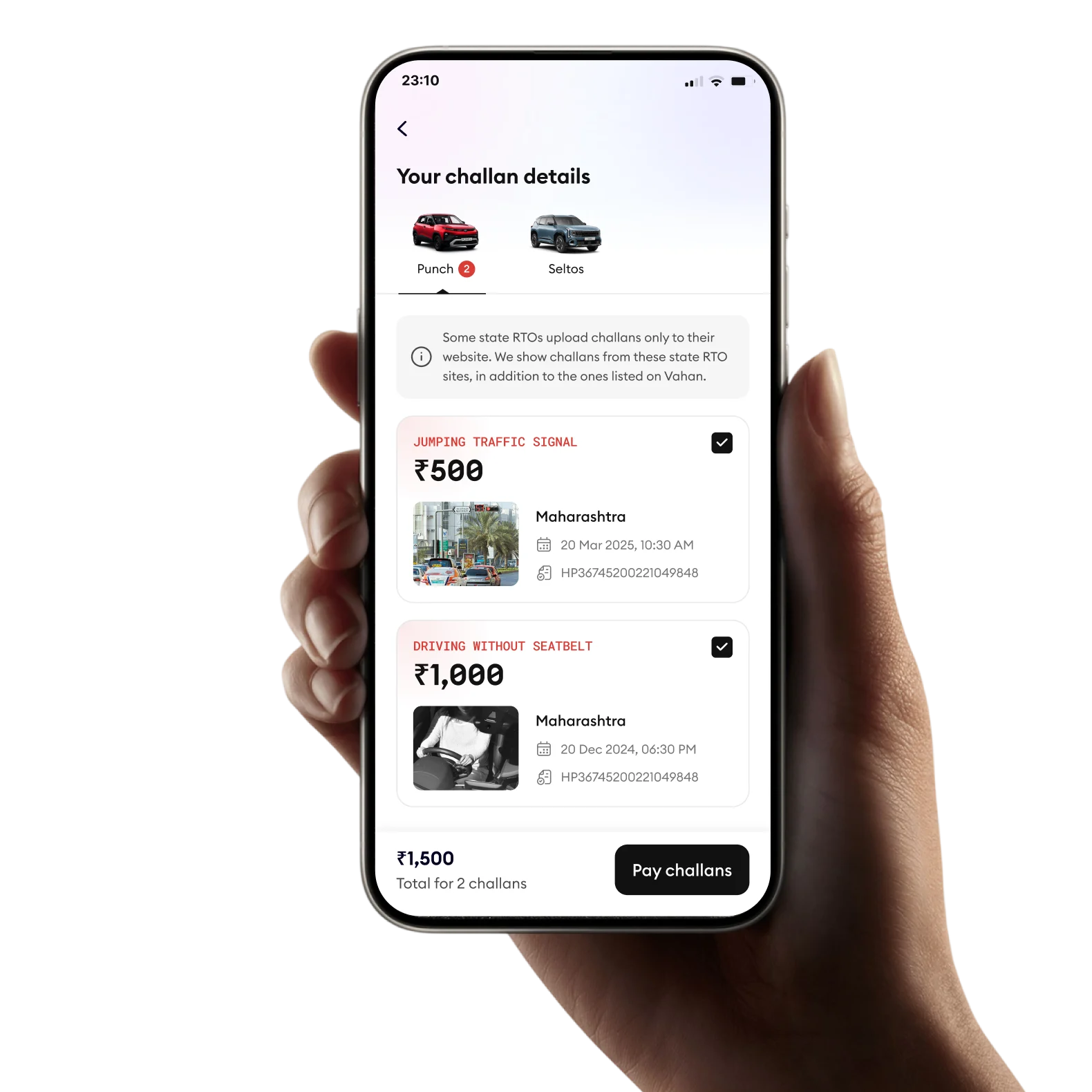
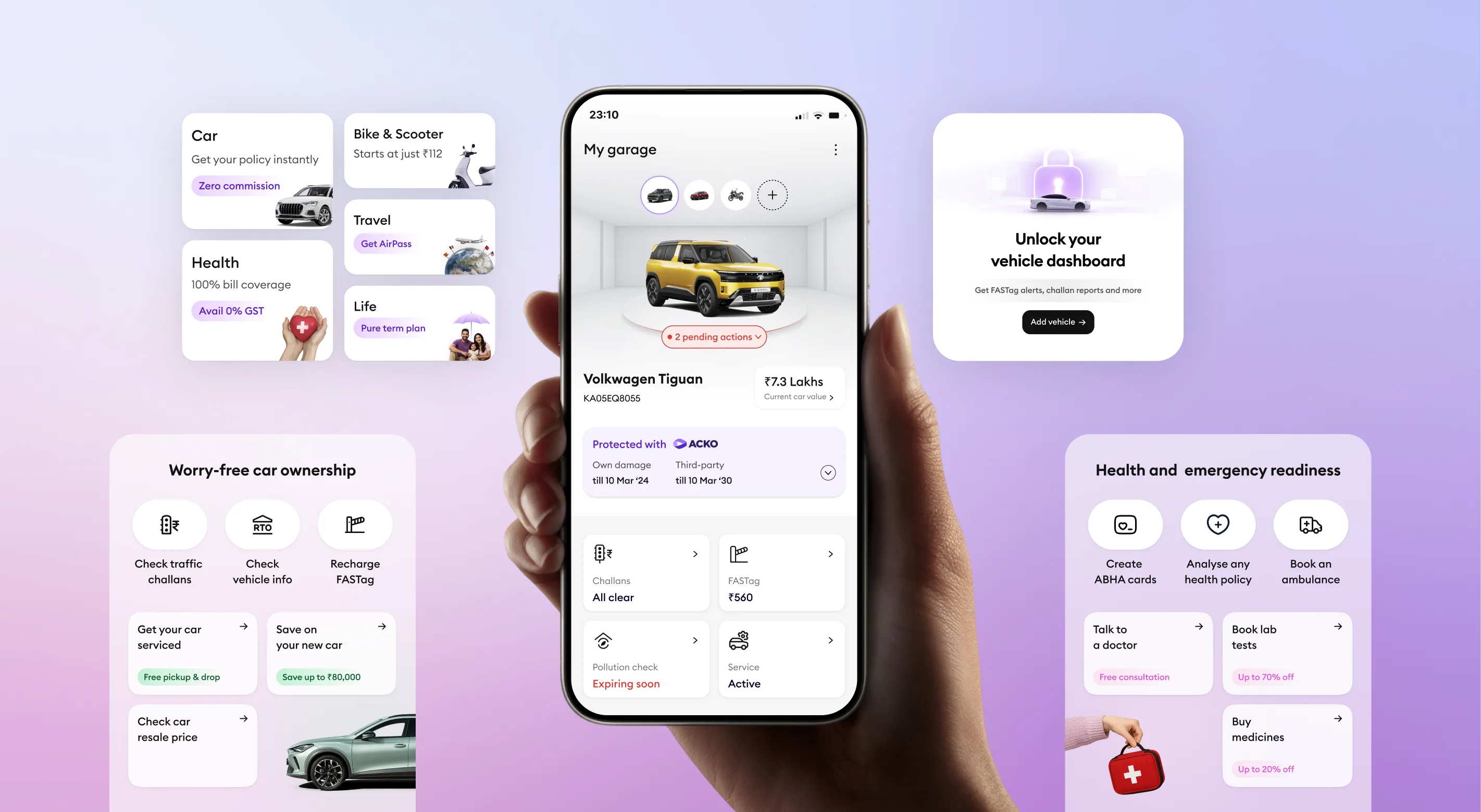
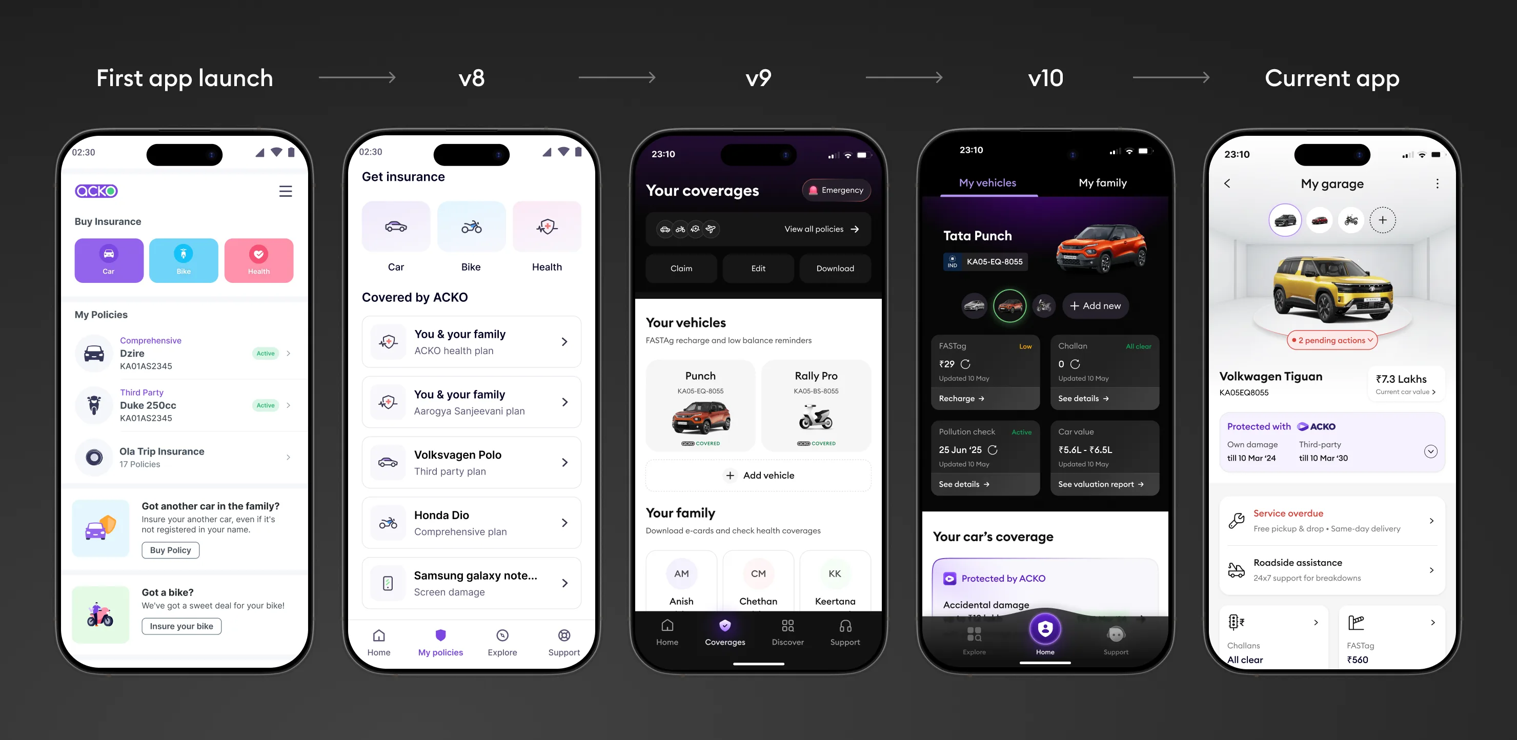
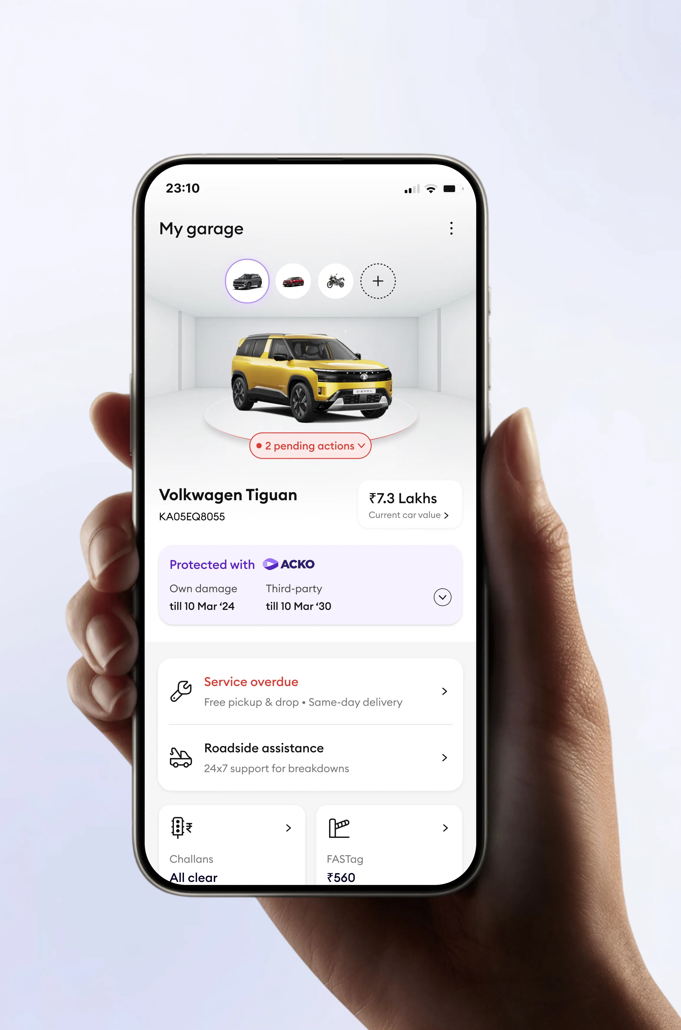
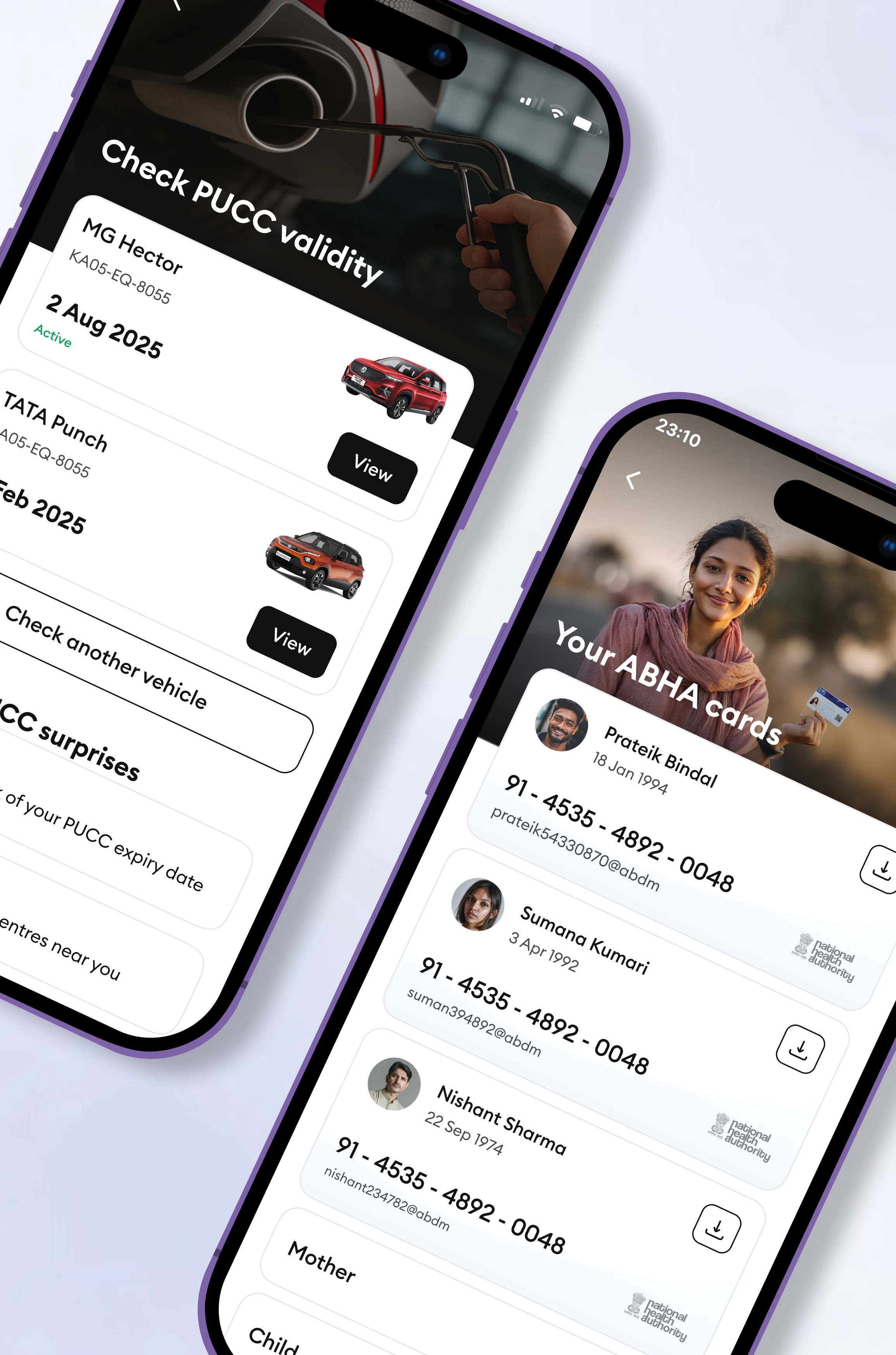
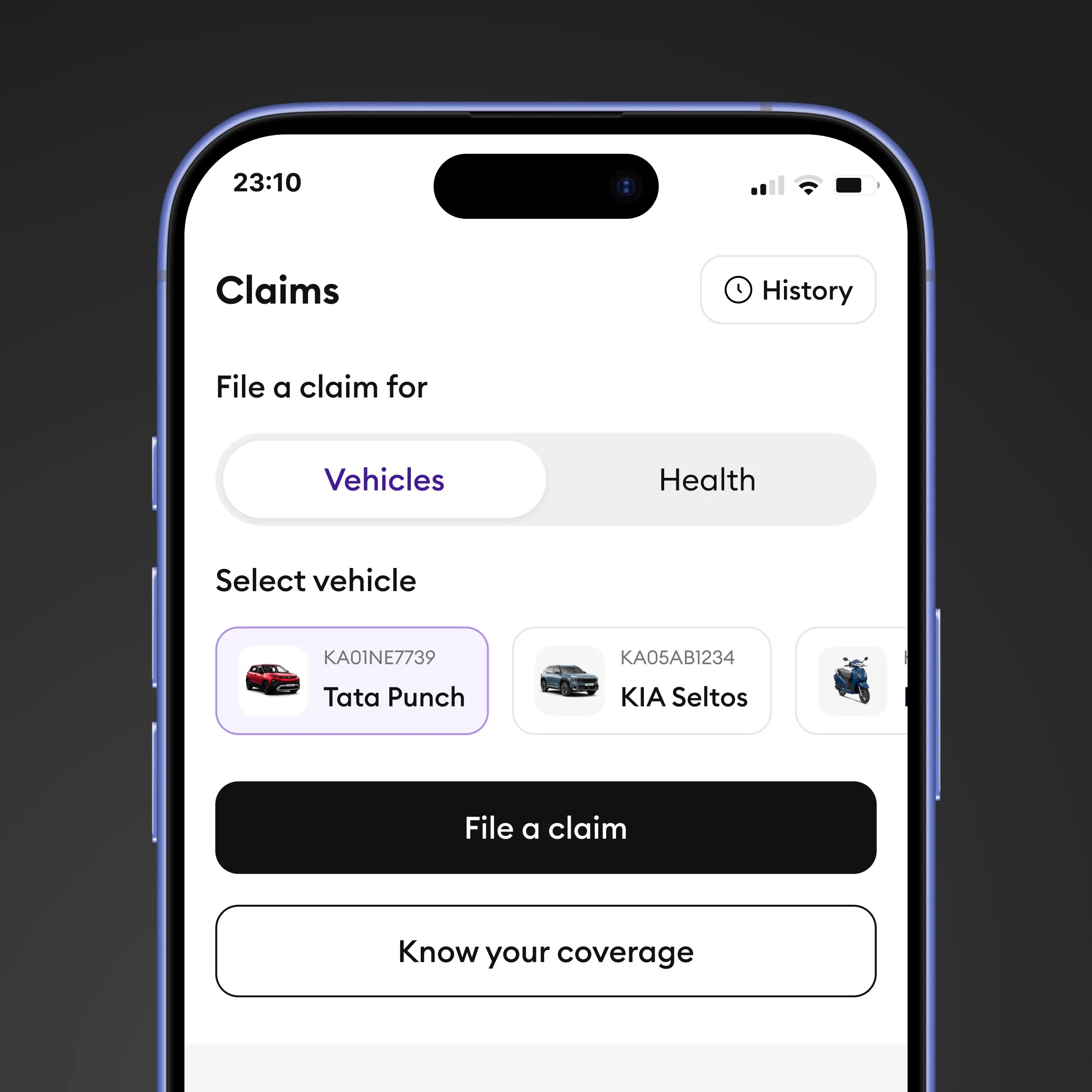
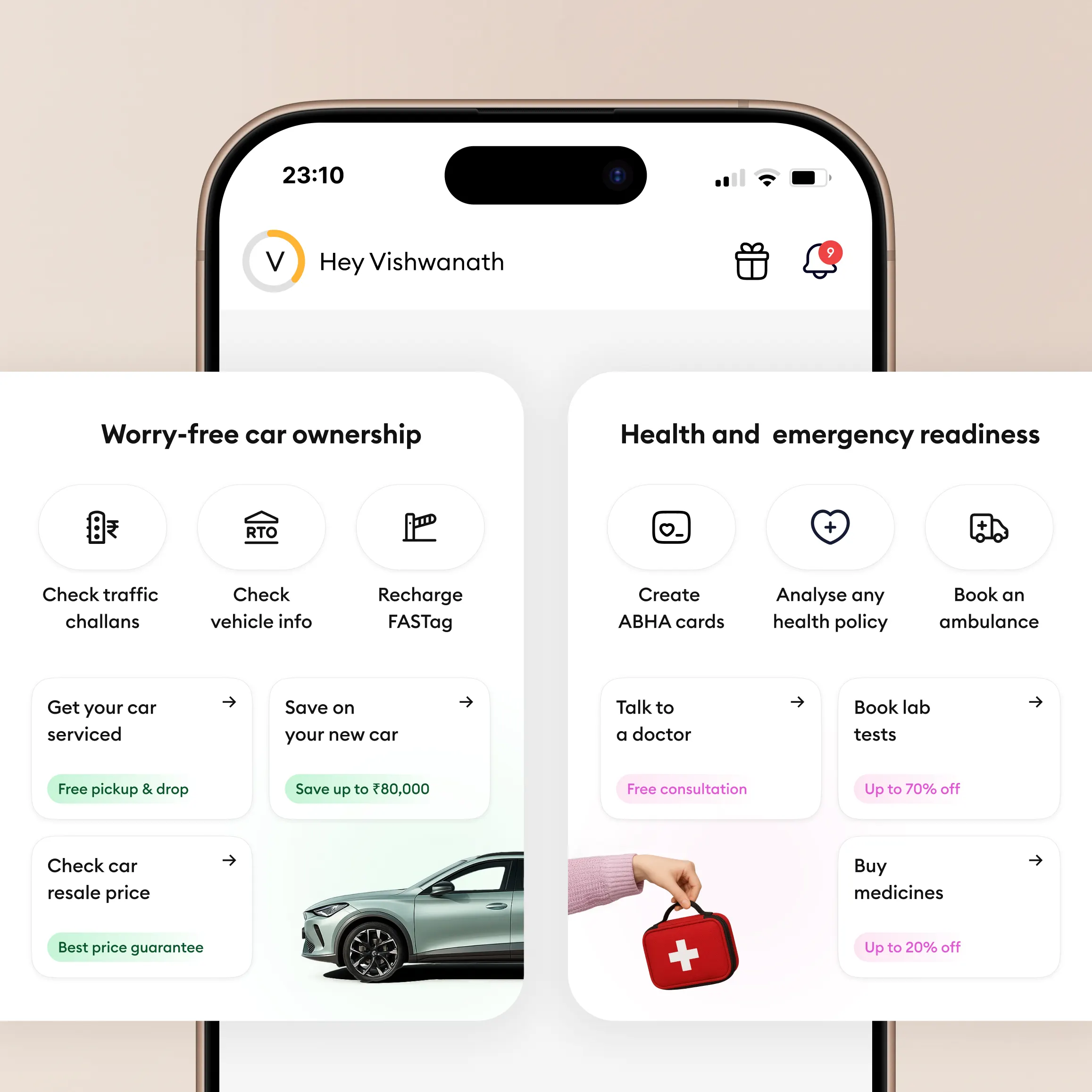
The core shift: organising the app around what users care about (their car, their bike, their family) instead of the policies we sell them. This unlocked a new category of contextual services like challans, FASTag, and emergency assistance that gave users weekly reasons to return. 4.6 million vehicles have been added to the app, most without an insurance policy. The app became ACKO's primary user acquisition and retention channel.
ACKO is one of India's leading D2C insurance companies. When I started leading design for the app, it did what every insurer's app does: show policies, let you download PDFs, and give you a number to call. Users opened it twice a year. Then it sat forgotten.
The company had a bigger ambition. Leadership wanted ACKO to evolve from an insurance seller into a "Protection Destination" built on three strategic pillars: Protect, Prosper, and Preserve, with Peace of Mind as the emotional promise.
The old app was organised around what ACKO sells: TP policy, OD policy, Health policy. But nobody wakes up thinking about policy types. They think: Is my car safe? Is my family covered? Am I ready for a road trip?
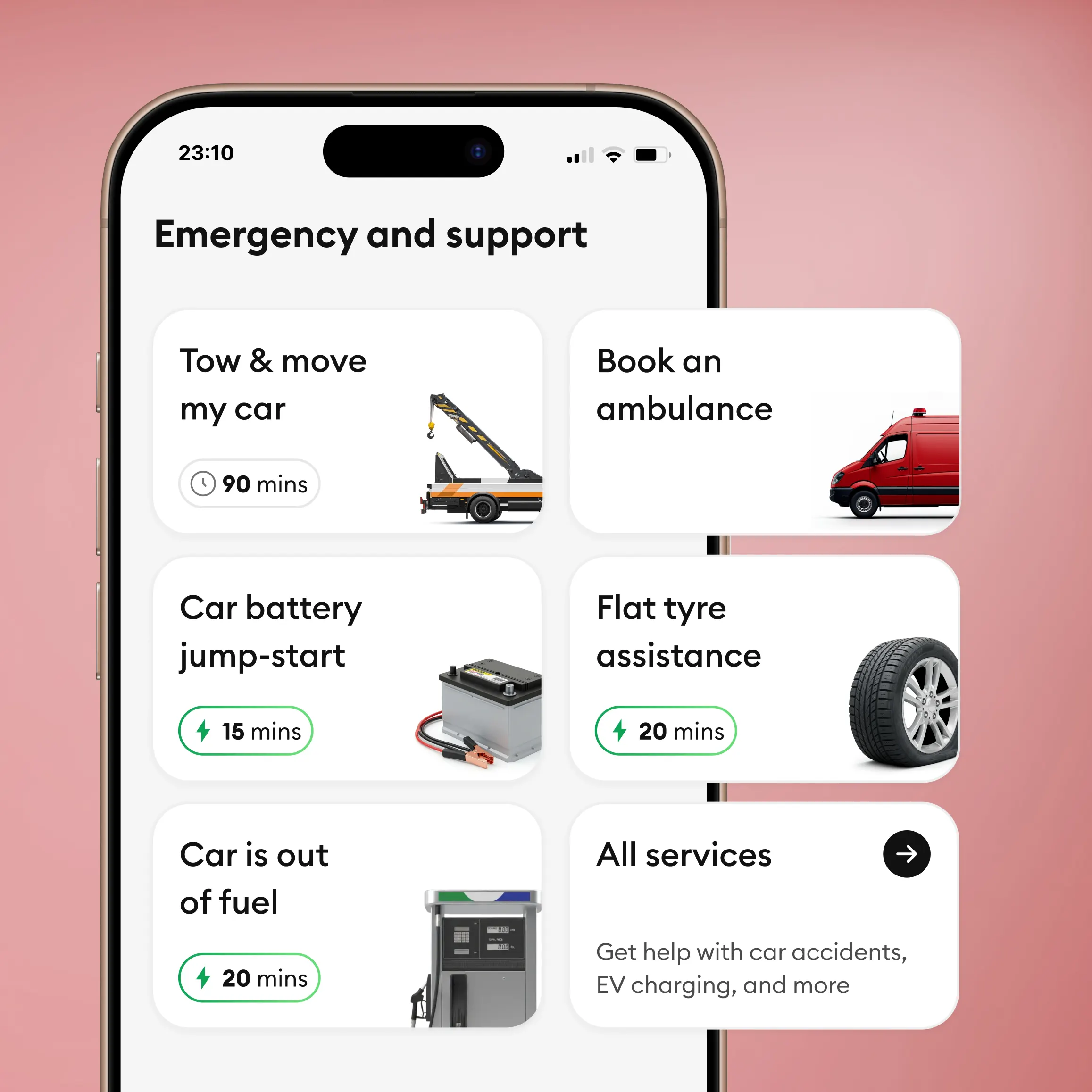
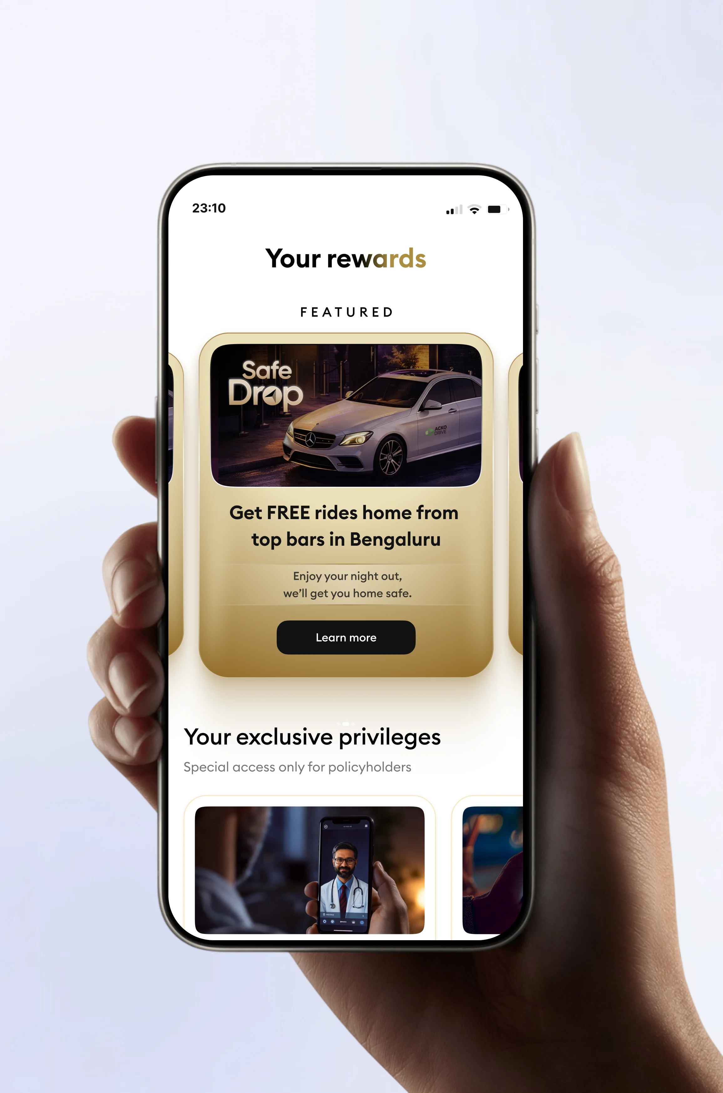
Give value first. Earn the right to sell later. The bet was simple: lead with free value, not insurance. Challan checks, FASTag recharge, PUCC reminders, emergency assistance. All free, no strings attached. The thinking was that continuous free value builds brand trust, and that trust converts to insurance when the right moment comes.
Each free service was designed as a behavioral loop. Not just a one-time feature, but a recurring reason to come back:
| Trigger | Action | Reward | Hook |
|---|---|---|---|
| Overdue challans? | Check & pay | Peace of mind Clean record | Check again in 30 days |
| FASTag low | Recharge | Peace of mind Trip-ready | Alert when low again |
| PUCC expiring | Find centre | Peace of mind Renewed | Status updated on app |
| Family covered? | Protection score | Peace of mind Clarity | Check when status changes |
| Road trip | Set up ResQ | Peace of mind Prepared | Safety tips before your next trip |
Every loop was optimised for two moments: the peak ("This is surprisingly easy") and the last moment ("Free, no strings attached"). These are the moments that shape how someone feels about the brand.
Three spaces. Each with a clear job.
What matters now.
The entry point and cross-sell engine. Contextual alerts, product storefront, feature spotlights.
Everything I care about.
My vehicles, family, travel, insurance coverage and free services all in one context.
Something went wrong.
Emergency services, quick policy actions, customer support. Optimised for stress states.
My Home is the heart of the redesign. It's the user's world. Open "My Vehicles" and you see your Honda City with all coverages across policies in one view, plus challans, FASTag, PUCC, emission certificate, and service history. Open "My Family" and you see who's covered, plus ABHA cards, health records, and a family protection score.
The company's Protect, Prosper, Preserve pillars set the direction. I translated each into design principles the team could work with:
Progressive disclosure of complex policy information. Contextual reassurance at every decision point. If a user can't understand their coverage in 10 seconds, the design has failed.
Showing what's unprotected not to scare, but to help plan. Predictive suggestions. Every "gap" framed as an opportunity, not a threat.
Reusable patterns. Embedded contextual help. Gentle edge-case flows. Every screen should feel familiar, even the first time you see it.
Key surfaces from the protection destination app: system-led UI, vehicle and family context, and desktop-scale workflows for content and tooling.
Every bet paid off. Since V9 launched in June 2024, the cumulative scale tells the story of a product that earned its place on millions of homescreens.
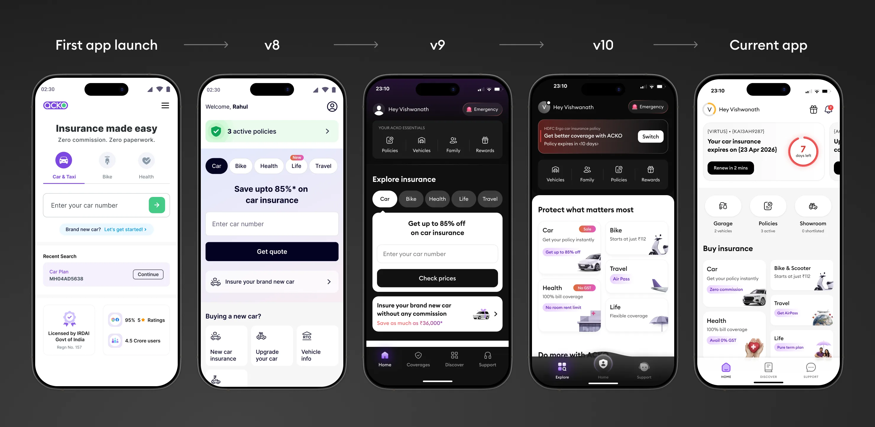
The V8 launch used a tab-based layout for product discovery. Through testing and iteration, we shifted to bento-style cards in V9 for better scannability and discoverability. The engagement data post-launch validated that decision.